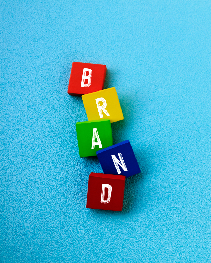
The Building Blocks of brand identity.
To create a strong Brand Identity, you have to first understand what the term Brand Identity means.
What is Brand Identity?
Brand identity is the collection of all tangible brand elements that a company creates to portray the right image of itself to its customer. Your Brand Identity is what makes you instantly recognizable to your customers and creates a connection between you and your customers.
The Foundation – Make Sure You Stand for Something
Before we can create a Brand Identity, we need to first define who you are as a brand. This is what we call Branding and is the process of creating and shaping a distinct brand. We believe that branding should be the foundation for all of your efforts as it’s an essential piece of your marketing puzzle.
Once we’ve identified who you are as a brand, the brand begins to come to life through the brand elements. These brand elements pave the way to what eventually evolves into the look feel of your brand.
The Building Blocks
When we talk about the brand elements, we’re essentially talking about the building blocks that make up your brand identity. Colors, fonts, design elements… There’s a reason why we choose particular colors and fonts or create a certain design element for a given brand.

Color
Colors have different meaning and can affect how people think or feel about your brand. They trigger a psychological response that influences the way we perceive something, including a brand. Everyone has psychological ties to colors. Using the right colors can make a huge difference in the way potential customers perceive your brand as well as how easily they remember your brand.
Red
Excitable – Energetic – Arousing – Loving – Fast – Passionate – Active – Loud
Red grabs consumers’ attention and wakes the senses. It stimulates arousal levels and whets the appetite. Red is the perfect choice if your brand identity is exciting, loud or youthful.
Orange
Creative – Friendly – Outgoing – Cheerful – Freshness – Health – Energy – Youth – Happiness – Adventure
Orange is often referred to as a “friendly” color. It’s a high-energy, creative and playful color used less commonly than red which allows brands to stand out.
Yellow
Imagination – Youthfulness – Happiness – Joy – Optimism – Enlightenment – Intelligence
Yellow is the color associated with warmth, sunshine and happiness. Its cheerful, optimistic vibe makes it a great choice if you want to elicit a fun, accessible response or stand out.
Green
Nature – Calming – Environmental – Fresh – Growth – Healthy – Calm – Peaceful – Quiet – Relaxing – Life – Youthful – Energy – Safe – Kind – Generous – Money
The ultimate in versatility, green is one of the most calming colors. Green is the easiest color for the eyes to process and brings to mind health, freshness, serenity and of course, money.
Blue
Reliability – Respect – Loyalty – Integrity – Classicism – Confidence – Protection – Trustworthy – Integrity – Dependability
The most universally appealing color in the spectrum, blue is the king of colors for brands and stands for being trustworthy, dependable, fiscally responsible, and secure.
Purple
Regal – Mysterious – Royal – Luxurious – Passionate – Sensuous – Spiritual – Dignified – Extravagant – Magical – Cutting Edge
Purple is a strong color with strong connotations. It’s the color of royalty so it works well for luxury brands. It’s also a great go-to for portraying brands as creative, imaginative or wise.
Pink
Fun – Modern – Youthful – Luxurious – Romantic – Delicate – Soft – Feminine
Pink is culturally tied to femininity but it’s more versatile than that. From pastel rose to neon magenta, pink is good choice for a modern, youthful, luxurious look.
Brown
Earthy – Home – Durability – Warm – Comforting – Approachable – Common – Sincere Masculine – Rugged – Natural
Brown is the most underutilized color by brands which means it will help you stand out. Brown is down-to-earth, simple and makes brands appear more rugged or masculine.
Black
Authoritative – Overpowering – Elegant – Classy – Conservative – Dignified – Serious -Dramatic – Oppressive – Powerful
Black means business, luxury and expense. If you want your brand to be viewed as modern or sophisticated, there’s nothing as classic and effective as black.
White
Youthful – Clean – Simple – Transparent – Pure – Quiet
White is actually the absence of all color but some of the strongest brands use it to stand out and create with a sense of transparency and cleanliness. White can work for almost any brand.

SERIF FONTS
Classic – Elegant – Formal – Sophisticated – Confident – Established – Traditional – Trustworthy – Old School – Reliable – Practical – Stable – Respectful – Timeless
(Examples: Times Roman, Times New Roman, Rockwell, Georgia and Baskerville, Didot, Garamond)
Serif typefaces can be identified by small divots on the ends of letterforms. These small strokes can be short or long, straight or angled or have varying weights
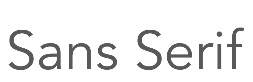
SANS SERIF FONTS
Modern – Sleek – Clean – Minimal – Clean – Direct Precise – Friendly – Humanistic – Geometric – Universal – Simple – Sensible – Straightforward – Easy To Read – Neutral
(Examples: Avenir, Helvetica, , Veranda, Arial, Futura, Franklin Gothic)
Sans serif typefaces lack any embellishment on the ends of letterforms, taking on a more simple shape.
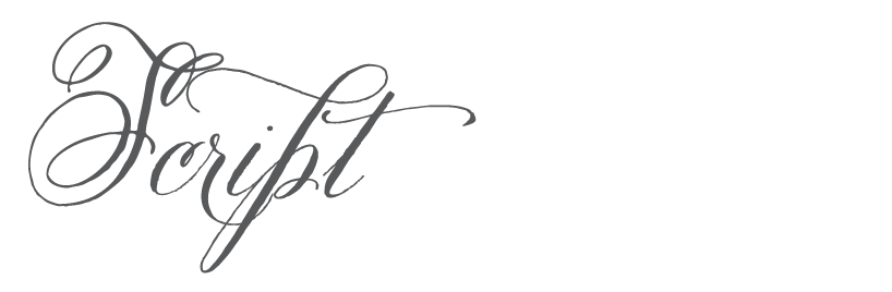
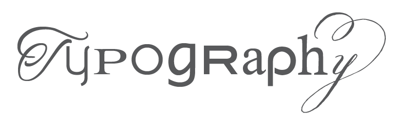
SCRIPT FONTS
Elegant – Classic – Formal – Sopisticated – Stylish – Luxurious – Feminine – Personal Fancy
(Examples: Quickpen, Allura, Pacifico, Buttermilk, Edwardian, Zapfino)
Scripts refer to the class of “handwriting” fonts and can be identified by the curve of letterforms and connecting strokes, which imitate cursive handwriting.

SLAB FONTS
Bold – Contemporary – Trendy – Friendly – Solid – Important – Evident – Impactful – Attention-Grabbing
(Examples: Clarendon, Copse, Josefin, Museo)
Slab fonts refer to almost any style of typeface with super thick stroke weights for all of the letters.
Form & Shape
Form and shape are also, subtle, but effective design elements used to create the desired response from your customers. A logo that is sharp and square will inspire a very different reaction from a logo that’s all circles and soft edges.
Vertical shapes are seen as strong.
Horizontal shapes are seen as peaceful.
Curved shapes offer rhythm and movement, happiness, pleasure and generosity. They are seen as more feminine than sharp shape.
Sharp shapes which offer energy, violence and anger. They are lively and youthful and viewed as more masculine.
People may not consciously realize a brand is using a certain shade of blue, serif font or shape in their Brand Identity but they will recognize your overall Brand based on the identity created.
Looking to create a new brand or revamp and existing one? Contact us at info@brandstormcreative.com